一、封装背景与需求分析
1. 老项目技术困境
在公司某核心业务系统中,存在一个运行多年的 jQuery 老系统。随着业务复杂度提升,原有 UI 组件库不满足业务要求:缺乏 现代树形控件 必备的多选、懒加载、节点合并等能力
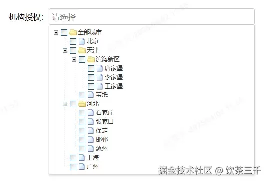
特别是在机构管理模块中,急需实现类似下图的多层级多选功能:
2. 选型决策
在传统 jQuery 项目中实现组件化面临三大障碍:
• 全局污染:命名冲突、样式覆盖
• 复用困难:依赖特定上下文环境
• 维护成本高:逻辑与 DOM 强耦合
Web Components 提供了浏览器原生的解决方案:
| 特性 | 作用 | 在本组件中的应用场景 |
|---|---|---|
| Custom Elements | 自定义 HTML 标签 | <select-tree> 声明式使用 |
| Shadow DOM | 样式隔离与封装 | 组件内部样式与全局样式隔离 |
| HTML Templates | 声明式 DOM 结构 | 组件模板与逻辑分离 |
| ES Modules | 模块化开发 | 组件代码组织与依赖管理 |
最终,我决定采用以下方案:
• 技术栈选择:纯 Web Components 方案(Custom Elements + Shadow DOM)
• 底层依赖:复用 ZTree 核心能力(节点操作、事件体系、懒加载)
• 隔离策略:通过 Shadow DOM 实现样式沙箱,避免污染老项目全局样式
该方案在兼容性、开发效率和维护成本之间取得最佳平衡。
二、组件架构设计
1. 核心设计原则
• 分层解耦:将 DOM 操作、事件处理、数据管理划分为独立层级
• 最小侵入:仅暴露必要的 public API(setValue/getValue等)
• 渐进增强:降级支持普通 input 行为,保证基础可用性
2. 技术实现亮点
(1)Shadow DOM 封装
<!-- Shadow DOM 结构 -->

<div class="select-tree-container">

  <input readonly class="select-input">

  <div class="tree-container ztree"></div>

</div>


/* Shadow DOM 样式 */

<style>

  :host { display: inline-block; }

  .select-input {

    width: 100%;

    padding: 8px;

    border: 1px solid #ccc;

  }

  .tree-container {

    position: absolute;

    top: 100%;

    max-height: 300px;

    overflow-y: auto;

  }

</style>
(2)双向数据绑定
通过自定义事件实现与外部系统的双向通信:
// 值变更时触发自定义事件

_updateValue() {

  const checkedNodes = this.handleCheckedNodesData();

  this.dispatchEvent(

    new CustomEvent("value-change", {

      detail: { value: checkedNodes.map(n => n.id) },

      bubbles: true,

      composed: true

    })

  );

}


// 外部可通过 value 属性设置初始值

static get observedAttributes() {

  return ['value'];

}


attributeChangedCallback(name, oldValue, newValue) {

  if (name === 'value') {

    this.setValue(newValue.split(','));

  }

}
三、核心代码解析
1. Web Components 基础搭建
class SelectTree extends HTMLElement {

  constructor() {

    super();

    this.attachShadow({ mode: 'open' });


    // 初始化 Shadow DOM

    this.shadowRoot.innerHTML = `

      <style>

        /* 组件内联样式 */

        .select-input { ... }

        .tree-container { ... }

      </style>

      <div class="select-tree-container">

        <input readonly class="select-input">

        <div class="tree-container ztree"></div>

      </div>

    `;


    // 缓存 DOM 引用

    this.inputElement = this.shadowRoot.querySelector('.select-input');

    this.treeContainer = this.shadowRoot.querySelector('.tree-container');


    // 事件绑定

    this.inputElement.addEventListener('click', () => this.toggleTree());

    document.addEventListener('click', (e) => {

      if (!this.contains(e.target)) {

        this.closeTree();

      }

    });

  }


  connectedCallback() {

    // 初始化树容器

    this.initTree();

  }

}


customElements.define('select-tree', SelectTree);
2. 树形功能增强
(1)多选逻辑封装
handleCheckedNodesData() {

  const nodes = this.tree.getCheckedNodes(true);

  return this.mergeNodeType === 'leaf'

    ? nodes.filter(n => !n.children)

    : nodes;

}


updateValue() {

  const checkedNodes = this.handleCheckedNodesData();

  this.value = checkedNodes.map(n => n.id);

  this._updateInputText();

}
(2)样式隔离实践
/* Shadow DOM 内样式 */

.select-tree-container {

  position: relative;

  width: 100%;

}


/* 透传 ZTree 基础样式 */

.tree-container {

  padding: 5px;

  border: 1px solid #ccc;

}


/* 自定义展开图标 */

.tree-container .node-icon {

  margin-right: 8px;

}
四、与老项目集成实践
<!-- 第一阶段:独立页面验证 -->

<select-tree id="demoTree"></select-tree>


<script>

   document.getElementById('demoTree').init();
   document.getElementById('demoTree').setOptions([]);
</script>


<!-- 第二阶段:局部替换 -->

<div>

  <label>所属机构:</label>

  <select-tree id="deptId"></select-tree>

</div>


<!-- 第三阶段:全局样式适配 -->

<link rel="stylesheet" href="/css/ztree-overrides.css">
通过以上实践,我们在保留 ZTree 核心能力的同时,成功将其改造为符合现代标准的 Web Component 组件,显著提升了组件复用率和开发效率。