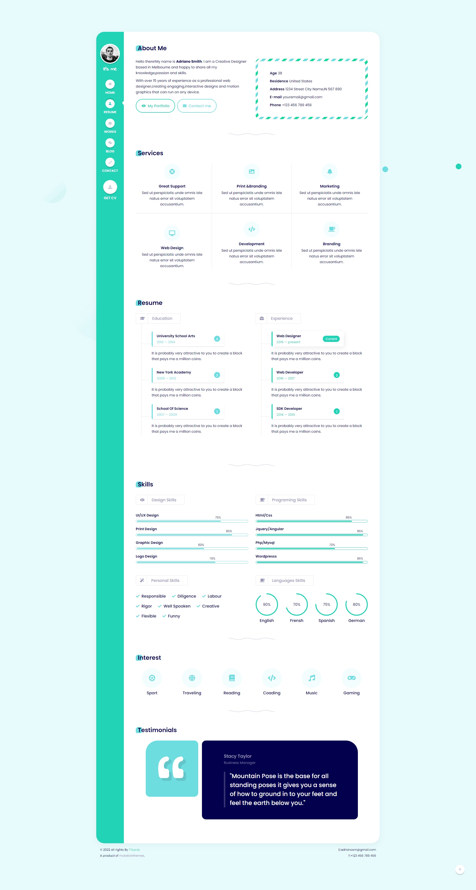
前言
最近接到一个需求,实现一个根据传入'数字',来显示一个圆环的进度条。期间各种百度,gpt都没解决,没达到预想的结果。然后就不了了之了..........
意外之中在技术群里聊天,顺便提出了这个问题,没想到群友分分钟解决🤦♂️🤦♂️🤦♂️🤦♂️🤦♂️
在此记录一下
<html>
<head>
<meta charset="UTF-8">
<meta name="viewport" content="width=device-width, initial-scale=1.0">
<title>睡眠评分</title>
<link rel="stylesheet" href="./styles.css">
</head>
<body>
<div>
<div>
<div>
<!-- 内层灰色圈 -->
<div></div>
<!-- 外层渐变圈 -->
<div></div>
<div>
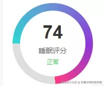
<span>74</span>
<span>睡眠评分</span>
<span>正常</span>
</div>
</div>
</div>
<div>
<input type="range" min="0" max="100" value="74">
<span>74%</span>
</div>
</div>
</body>
<script>
const progressControl = document.querySelector('.progress-control');
const circleProgress = document.querySelector('.circle-progress');
const numberElement = document.querySelector('.number');
const progressValue = document.querySelector('.progress-value');
progressControl.addEventListener('input', function(e) {
const value = e.target.value;
const gradient = `conic-gradient(
from -90deg,
#2CD8D5 0%,
#6B8DD6 ${value}%,
#8E37D7 ${value}%,
#FF3784 ${value}%,
#ddd ${value}%,
#ddd 100%
)`;
circleProgress.style.background = gradient;
numberElement.textContent = value;
progressValue.textContent = value + '%';
});
</script>
</html>style.css 样式
    display: flex;
    flex-direction: column;
    align-items: center;
    gap: 20px;
    padding: 20px;
}
.sleep-score {
    width: 200px;
    height: 200px;
    position: relative;
    background: #fff;
    border-radius: 10px;
    box-shadow: 0 0 10px rgba(0, 0, 0, 0.1);
    padding: 20px;
    display: flex;
    align-items: center;
    justify-content: center;
}
.circle-wrapper {
    width: 160px;
    height: 160px;
    position: relative;
    display: flex;
    align-items: center;
    justify-content: center;
}
/* 内层灰色圈 */
.circle-inner {
    position: absolute;
    width: 150px;
    height: 150px;
    background: #f5f5f5;
    border-radius: 50%;
}
/* 外层渐变圈 */
.circle-progress {
    position: absolute;
    width: 160px;
    height: 160px;
    border-radius: 50%;
    background: conic-gradient(
        from -90deg,
        #2CD8D5 0%,
        #6B8DD6 25%,
        #8E37D7 50%,
        #FF3784 74%,
        #ddd 74%,
        #ddd 100%
    );
}
/* 中心白色区域和文字 */
.score {
    width: 120px;
    height: 120px;
    background: white;
    border-radius: 50%;
    position: relative;
    z-index: 3;
    display: flex;
    flex-direction: column;
    align-items: center;
    justify-content: center;
}
.number {
    font-size: 36px;
    font-weight: bold;
    color: #333;
}
.text {
    font-size: 14px;
    color: #666;
    margin-top: 5px;
}
.status {
    font-size: 12px;
    color: #4cd964;
    margin-top: 5px;
}
/* 控制器样式 */
.control {
    width: 200px;
    display: flex;
    align-items: center;
    gap: 10px;
}
.progress-control {
    flex: 1;
    height: 5px;
    -webkit-appearance: none;
    appearance: none;
    background: #ddd;
    border-radius: 5px;
    outline: none;
}
.progress-control::-webkit-slider-thumb {
    -webkit-appearance: none;
    appearance: none;
    width: 15px;
    height: 15px;
    background: #2CD8D5;
    border-radius: 50%;
    cursor: pointer;
}
.progress-value {
    min-width: 45px;
    color: #666;
    font-size: 14px;
}
就是如此简单,根据锥形渐变!!!!!