在HTML和CSS中实现文章的居中显示,可以使用多种方法,包括内联样式、ID选择器、类选择器以及更高级的布局技术如Flexbox或Grid,下面我将详细说明每种方法,并提供一些例子。
使用内联样式
内联样式是最简单的方法之一,适用于小范围内的内容居中。
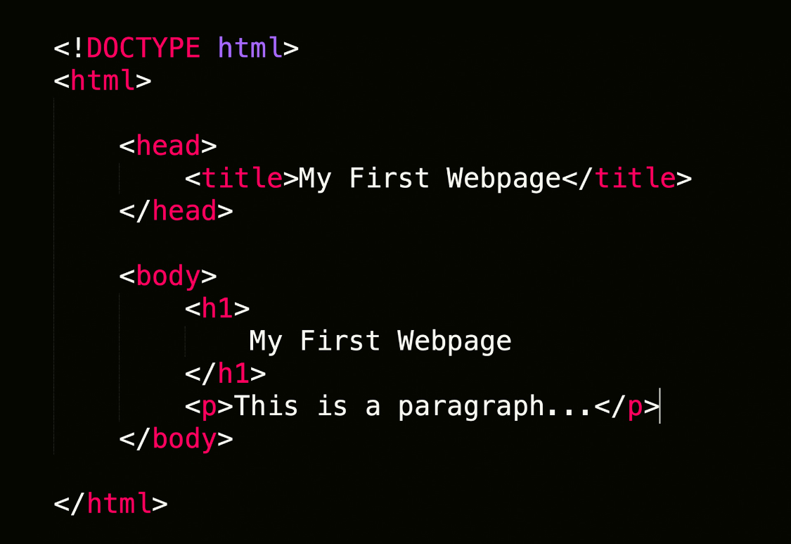
<!DOCTYPE html>
<html lang="en">
<head>
    <meta charset="UTF-8">
    <meta name="viewport" content="width=device-width, initial-scale=1.0">居中显示文章</title>
    <style>
        .centered-text {
            text-align: center;
        }
    </style>
</head>
<body>
    <div class="centered-text">
        <p>This is some sample text that will be centered on the page.</p>
    </div>
</body>
</html>
在这个例子中,.centered-text是用于包裹文本的容器,通过添加text-align: center;属性使其内容居中对齐。

使用ID选择器
对于特定元素的居中效果,可以使用ID选择器。
<!DOCTYPE html>
<html lang="en">
<head>
    <meta charset="UTF-8">
    <meta name="viewport" content="width=device-width, initial-scale=1.0">居中显示文章</title>
    <style>
        #centered-text {
            position: relative;
            margin-left: auto;
            margin-right: auto;
        }
    </style>
</head>
<body>
    <h1 id="centered-text">这是标题</h1>
    <p>这是文章内容。</p>
</body>
</html>
这里我们使用了#centered-text作为ID选择器,然后设置了position: relative;以允许绝对定位,接着通过margin-left: auto;和margin-right: auto;来使该元素居于页面中心。
使用CSS Flexbox
Flexbox是一种强大的布局工具,非常适合实现居中显示。
<!DOCTYPE html>
<html lang="en">
<head>
    <meta charset="UTF-8">
    <meta name="viewport" content="width=device-width, initial-scale=1.0">居中显示文章</title>
    <style>
        .container {
            display: flex;
            justify-content: center;
            align-items: center;
            height: 100vh; /* 垂直和水平居中 */
        }
        .content {
            padding: 20px;
            background-color: #f0f0f0;
        }
    </style>
</head>
<body>
    <div class="container">
        <div class="content">
            这是一段居中的文章。
        </div>
    </div>
</body>
</html>
在这个例子中,.container使用了display: flex;来启用Flexbox,并且通过justify-content: center;和align-items: center;来确保其内容在垂直和水平方向上都居中。

使用CSS Grid
CSS Grid也支持居中显示,可以通过列和行的交叉点来定位内容。
<!DOCTYPE html>
<html lang="en">
<head>
    <meta charset="UTF-8">
    <meta name="viewport" content="width=device-width, initial-scale=1.0">居中显示文章</title>
    <style>
        body {
            display: grid;
            place-items: center;
            height: 100vh;
        }
        .article-container {
            width: 50%;
            background-color: #f9f9f9;
            border: 1px solid #ccc;
            padding: 20px;
        }
        .article-title {
            font-size: 24px;
        }
    </style>
</head>
<body>
    <div class="article-container">
        <div class="article-title">
            文章标题
        </div>
        <div class="article-content">
            这是一段居中的文章内容。
        </div>
    </div>
</body>
</html>
在这个例子中,.article-container使用了place-items: center;来确保其内容在页面中央,同时保持了适当的宽度和边距。
四种方法都可以有效地实现网页内容的居中显示,你可以根据具体需求和项目的复杂程度选择最合适的方案。